Horror-themed visual novel
Screenshots
In this title, you will converse with a shadowy nighttime visitor. You can help the visitor build up a picture of itself, or ignore the character and see what happens. Multiple conversation options lead to different story paths.
Interesting story with plain execution
Visual novels, or interactive stories, are a tough genre to do well. Generally speaking, the visual element consists of static or basically-animated screens, with the story taking the form of multiple-choice conversation options. (Don’t) Open Your Eyes follows these conventions to the letter.
Settings and graphics
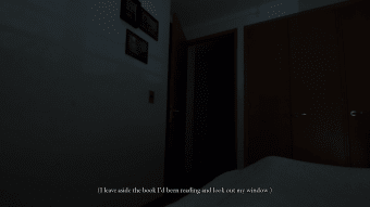
The game only has one location: a bedroom. Visual novels typically involve illustration rather than cutting-edge graphics, and this game follows suit. The bedroom is a still image, and the nighttime version is a roughly sketched outline.
(Don’t) Open Your Eyes doesn’t need more than this, but it’s still a shame that there’s no way to, for example, look around the room or watch as ambient lighting changes shadows. The monster, too, should be a source of concern but its different body parts often look goofy instead of menacing.
Conversation branches
As you’re trying to sleep, a mysterious creature appears and begins a conversation with you. Although your thoughts are presented on-screen, your voice is never heard and only represented as multiple choice answers to the creature’s questions.
The game then reacts to your choices, granting the monster the features you select. Does it have sad or vacant eyes? Claws or incomplete hands? Each option then unlocks slightly different dialogue from the monster.
Variety
The creature is fully-voiced and well-acted, with its story and musings changing depending on how you describe it. There are 27 possible combinations of body parts and dialogue branches, which gives the game some replayability.
Spooky, yet rough, visual novel
(Don’t) Open Your Eyes doesn’t quite have the literary chops to execute its basic concept. There’s pathos to be found in the creature’s uncertainty of what it is, but the script tends to be flowery rather than concise. It’s a nice idea, but the the title lacks finesse.


